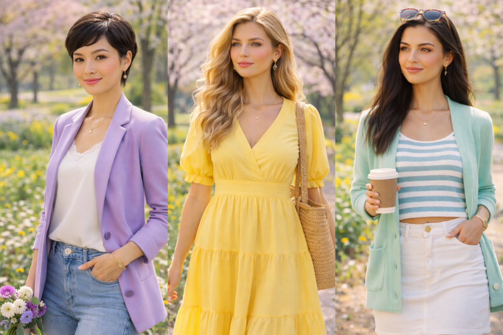
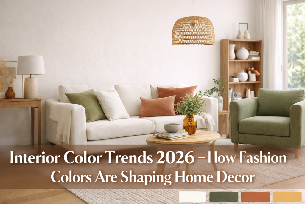
Grounded Neutrals, Tailored Darks & Earthy Vibrancy
Paint trends in 2026 are moving in two complementary directions: warm, grounding neutrals that make a home feel calm and timeless, and bolder, more confident shades used in a deliberate, design-forward way. The big shift isn’t that people suddenly want loud color everywhere—it’s that “statement” now means depth, tone, and placement rather than chaos.
Below are the top paint color trends shaping interiors in 2026, plus practical, room-by-room ways to use them.
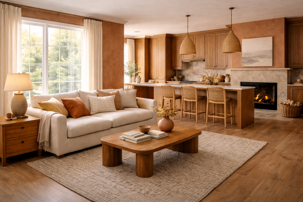
1) Foundational Warm Neutrals: Khaki, Sand, and Soft Greige
In 2026, neutrals are still king—but they’re warmer, richer, and more lived-in than the cool grays of past years. Expect to see:
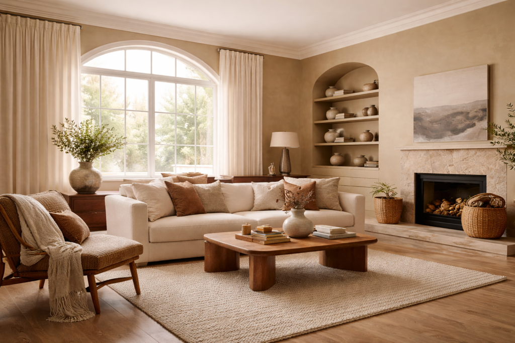
- khaki and “universal” beige tones
- sand and oat shades
- camel-leaning greige
- creamy neutrals with a subtle golden undertone
Why they’re trending: these colors make spaces feel inviting, they flatter wood tones, and they work beautifully with natural materials like stone, linen, and leather.
How to use this trend well
- Paint main living areas in a warm neutral and use slightly lighter trim for softness.
- Create “depth” through texture (bouclé, wool, linen) rather than harsh contrast.
- Pair with warm metals (brass, bronze) and medium-to-dark woods for a refined look.
2) Soft Whites with Warmth: Clean, Airy, and Calming
White is evolving in 2026. The most popular whites are no longer stark or icy; they’re soft, airy whites that feel calm, modern, and “quiet luxury.” These whites are ideal if you want brightness without the clinical look.
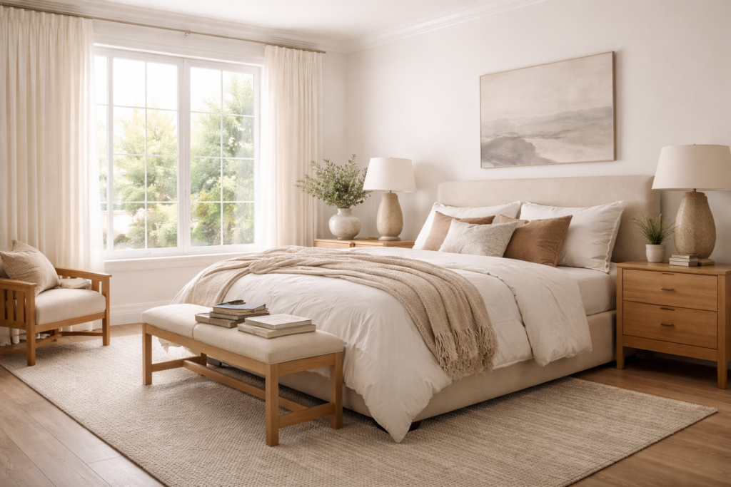
Where soft whites shine
- bedrooms (calm, hotel-like feel)
- hallways (makes spaces feel larger)
- ceilings (adds light without glare)
- north-facing rooms (where harsh whites can turn bluish)
How to style it
- Add warmth with natural woods and warm lighting.
- Use textured finishes—matte walls, linen curtains, woven rugs—so white feels layered, not flat.
3) Tailored Darks: Espresso, Chocolate-Charcoal, and Near-Black Browns
The 2026 version of “bold” is often deep and sophisticated rather than bright. One of the strongest movements is toward tailored darks—colors that look like classic suiting: espresso-brown, chocolate with charcoal undertones, ink-like browns, and softened near-blacks.
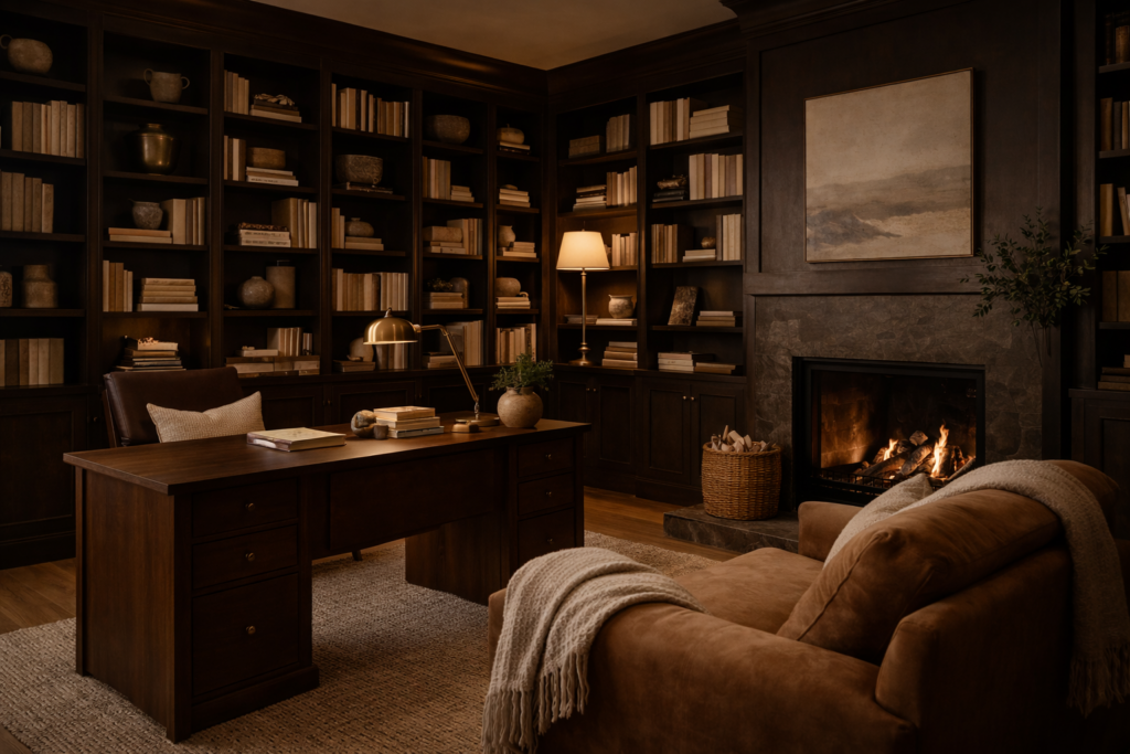
These shades feel luxurious because they create depth and make a room feel intentional.
Best rooms for tailored darks
- dining rooms (dramatic, warm, intimate)
- home offices (focused, high-end)
- powder rooms (small space, big impact)
- built-ins and fireplaces (custom millwork effect)
Pro tip
Dark colors look expensive when lighting is layered. Add sconces, table lamps, and warm bulbs so the color glows instead of feeling heavy.
4) Earthy Vibrancy: Terracotta, Ochre, Moss, and Muddy Blues
Earth tones are not new—but in 2026 they’re becoming more energized. Instead of dusty, muted neutrals, earthy palettes show up as:
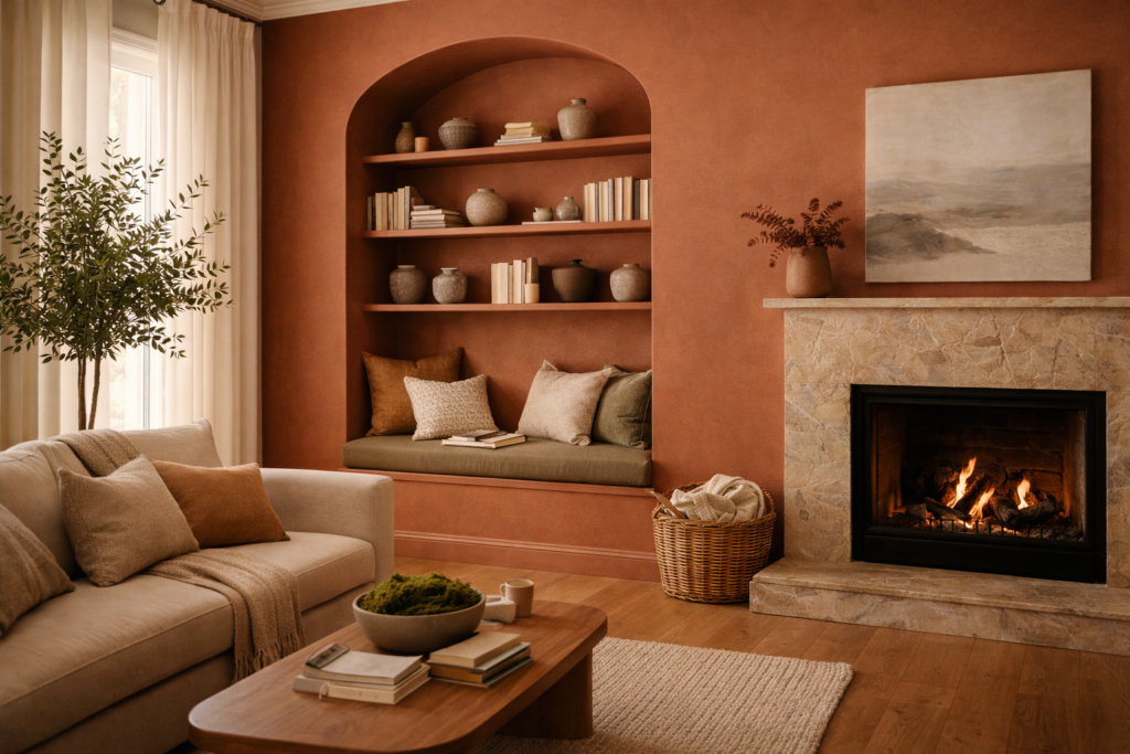
- rich terracotta and clay
- warm ochre and golden browns
- olive, moss, and forest greens
- “muddied” ocean blues
- deep plum-leaning tones
These colors work because they feel natural, yet they bring personality and warmth.
Easy ways to try Earthy Vibrancy
- Paint an accent wall in terracotta or mossy green.
- Use it on built-ins, shelving, or a hallway for a strong design moment.
- Pair with warm neutrals so the room still feels balanced.
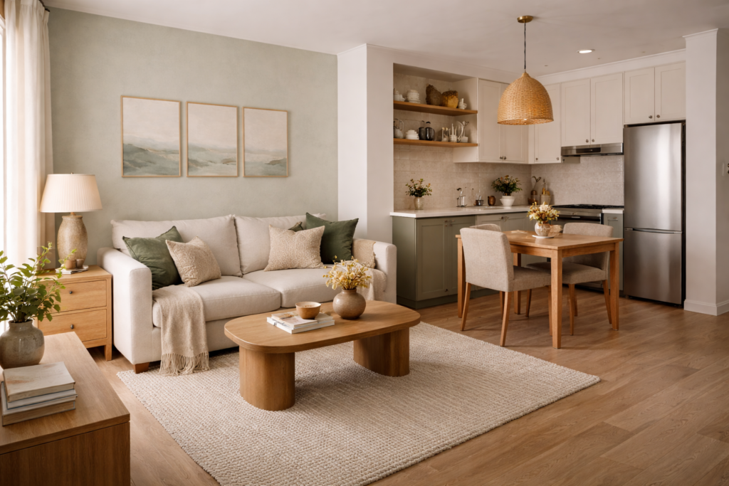
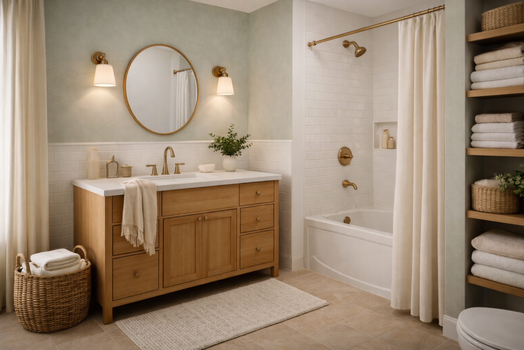
5) Frosted Tints: Modern Pastels That Don’t Feel Sweet
Pastels are returning, but in a more grown-up way. Instead of candy colors, 2026 favors frosted, softened tints:
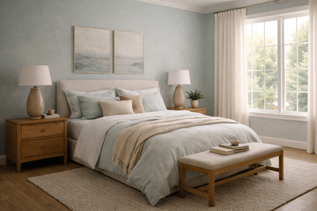
- whispery blue-greens
- pale misty blues
- milky lavender-gray
- cool, airy sage
These colors are light and fresh, but not childish—especially when paired with warm wood, stone, and neutral textiles.
Where frosted tints work best
- bathrooms (spa-like calm)
- bedrooms (soft, soothing atmosphere)
- kitchens (islands or lower cabinets, paired with warm counters)
6) Sunbaked Warmth: Cozy Golden Tones and Clay Neutrals
Another major direction for 2026 is “sunbaked” warmth—colors that feel like late-afternoon light:
- warm clay neutrals
- soft caramel tones
- muted warm golds
- sandy terracotta blends
These shades are perfect in homes that feel too cold or gray, because they add a natural “glow” even in winter.
Best uses
- entryways (welcoming first impression)
- living rooms (adds warmth without going too dark)
- kitchens and breakfast corners (bright, cozy energy)
7) How “Bold Statements” Actually Look in 2026
The trend isn’t about painting every wall a dramatic color. The modern approach is intentional placement:
Color drenching
Painting walls (and sometimes trim and ceiling) in one shade family for a fully designed, immersive room. Works beautifully with warm neutrals, deep browns, and olive greens.
Statement ceilings
A bold ceiling—especially in a smaller room—adds architecture and feels high-end without overwhelming the space.
One hero surface
Instead of scattered color, commit to one focal point: a fireplace wall, built-ins, a dining room wall, or a dramatic hallway.
Room-by-Room 2026 Paint Inspiration
Living Room
- Warm neutral walls + tailored dark accents (built-ins or fireplace)
- Add earthy vibrancy through one bold element: a mossy green wall or terracotta niche
Kitchen
- Soft white walls + warm wood and brass
- Frosted tint on an island or lower cabinets for a subtle modern twist
Bedroom
- Soft white base + deep espresso feature wall for a luxury feel
- Or frosted tint walls with warm neutral bedding for calm
Bathroom
- Tailored darks for a boutique-hotel vibe
- Or frosted tints paired with stone and warm lighting for spa energy
A Simple “2026-Proof” Palette Formula
If you want a palette that will look stylish beyond one season, use this structure:
- Base color: warm neutral or soft white
- Anchor shade: tailored dark (espresso or chocolate-charcoal)
- Nature note: moss/olive, terracotta, or ochre
- Finishing touches: warm metals + wood texture
This combination is the easiest way to get the 2026 look: grounded, warm, and refined—with just enough personality.
What to Skip in 2026 (If You Want the Most Current Look)
- overly cool gray everywhere (can read flat and dated)
- harsh bright whites without texture
- random accent colors that don’t connect to a palette
Final Takeaway
The top paint color trends for 2026 are all about comfort with intention. Warm neutrals form the foundation, soft whites create calm, tailored darks add sophistication, and earthy vibrancy brings personality. The result is a home that feels modern, elevated, and lived-in—without chasing fast trends.